Funeral Partners
Zest partner with Funeral Partners to re-launch their online presence
Re-launch online platform for 160+ branches
Raise the profile for associated brands
“The final result was fantastic. Both websites exceeded our expectations. So a big thank you to the team on the efforts!”
— Luke Wilkins, Digital & Web Development Manager at Funeral Partners
Objective
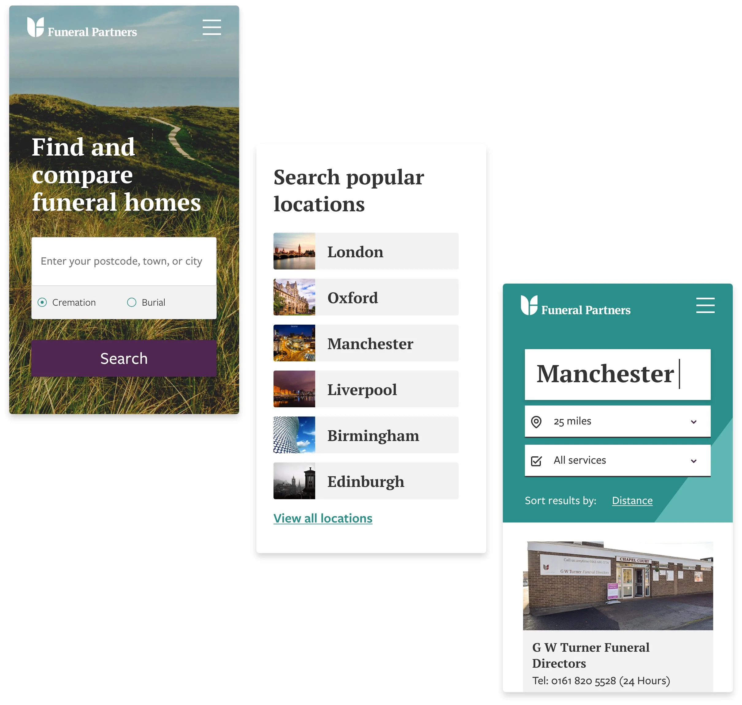
In a market where change is happening fast, we partnered with one of the UK’s leading providers, Funeral Partners, to help them claim their space online with stunning website design for two of their online properties.
Funeral Partners are in an exciting period of fast-growth and wanted a platform to promote and drive business to their network of 160+ branches.
Balancing the traditional foundations of the funeral industry with the expansive nature of Funeral Partner’s ambition was a delicately balanced challenge. Funeral Partners are in a constant state of growth and expansion, which was never reflected effectively online. Our client needed a presence that allows them to realise their initial goals. These were to:
Provide users with key information and pricing for our 160+ UK branches
Raise the profile of our associated brands through an increased digital footprint
Give the Funeral Partners team a platform to attract new talent
Strategy
Understanding the user
Throughout the project (or any project) we aimed to bring the users the front of our minds. Having four main questions helped to focus the design process:
Who are the users?
What are their goals?
What will their journey look like?
How can we make their journey better?
Many of our client’s users are classed as ‘at need’. Their journey to the Funeral Partners website is (understandably!) one of necessity rather than choice.
Understanding this requirement was a key step in designing a platform which allows a user to achieve their goals quickly without any added stress to the task at hand.
After thorough consultation and empathy mapping with the Funeral Partners internal team, we defined our user persona as ‘Craig Parsons’.
Craig is looking to find funeral directors in his local area who are well respected. As the eldest child, Craig has taken on the responsibility of organising the funeral and managing his father’s estate. His father has not arranged a pre-planned funeral option, but has been unwell for a while. Craig has taken the day off work to arrange the funeral. He is using his laptop to carry out a focused research session.
Staying true to the heritage
Funeral Partners have a proud twelve year history which needed to be represented throughout their online presence.
Part of the challenge was to ensure we adhered closely to the brand guidelines for the group. These are rolled out to each one of their 160+ branches, so detail was crucial. Having a consistent path from website to branch is important as it gives a user a sense of reassurance at a difficult time.
Critical feedback
To better understand the digital presence of Funeral Partners, we looked at their existing website and assessed what they were missing and how improvements could be made.
The interface needed some love and, as with many WordPress installations, custom themes tend to date quickly and require strenuous development to stay ahead of the curve. The cost of maintenance was no longer sensible, and this is something we see across many projects.
Heavy colouring, dated typography, and uninspiring visual assets could all be improved to lift the experience for the user. A confusing search function added unnecessary and unwelcomed friction to the user experience.
We set out to improve this for our client’s customers.
Structure for growth
We believe strongly that each part of a website must add value to the user experience or the business its serving. If no value is added, then each non-effective part is detracting value.
A strong sitemap is key to digital success, so our team went to work on creating strong foundations for Funeral Partners. This included:
Defined hierarchy for location landing pages
Introduction of a Help and Advice area
Reduce sitemap ‘bloat’ (typical of ageing websites)
Bringing visual assets up to date
A complete visual overhaul encompassed; the colour palette, typography, iconography and updated photography assets. These once ‘meh’ elements of the website were re-energised and re-imagined to lift the entire website.
Future focus
One of the major focuses for Funeral Partners was to realise the vision of their recruitment team. Historically there had always been a recruitment function online, but it was not a place where the team could direct prospective employees to with confidence. This disconnect contributed to lost opportunities to recruit the best people for their business.
Our plan was to launch a subdomain within the Funeral Partners brand to help drive job hunters to specific landing pages. This allowed us to integrate leading talent acquisition software, Vacancy Filler, into our custom user interface.
The end product is future focused, lifting and improving the experience for the end customer whilst enabling Funeral Partners to hire new talent as they continue with their rapid growth.
Growth team
-

Laura D
Head of Client Services
-

Tim P
Graphic Designer
-

Louis L
Head of Operations


